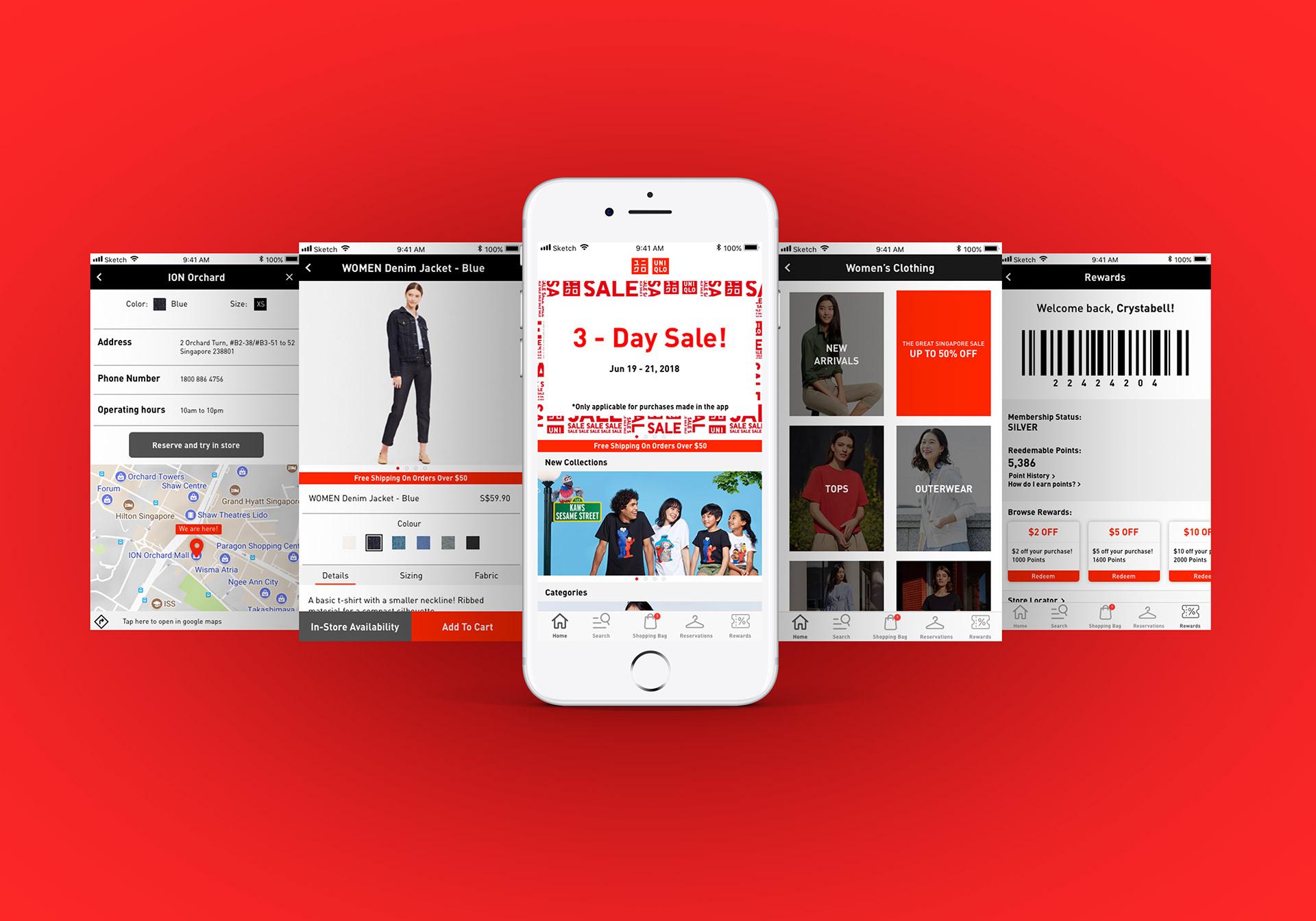
Uniqlo — Retail UX
Bringing Uniqlo's online and offline shopping into one app, a research-led redesign.
Project Overview
Client: Uniqlo
Industry: Retail, E-commerce
My Role: Product Designer
Uniqlo had a mobile app most of its shoppers didn't use despite strong brand loyalty, customers defaulted to competitors' apps to shop online. This project reworked the experience to make the app worth opening, connecting online and in-store shopping into one flow.
What the research actually showed
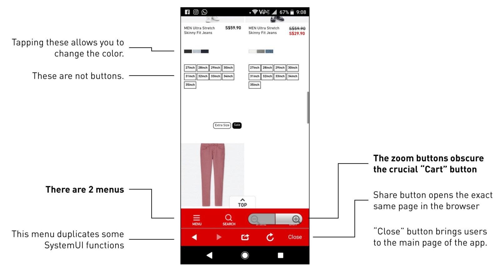
Two findings drove the redesign. First, the existing app confused core actions — non-obvious buttons, duplicated menus, controls that obscured the cart. Second, most people who did open the app used it only for promo codes, not shopping. The opportunity wasn't a visual refresh; it was making the app worth opening in the first place, and connecting the online and in-store experience Uniqlo shoppers actually moved between.
A decision that came from testing
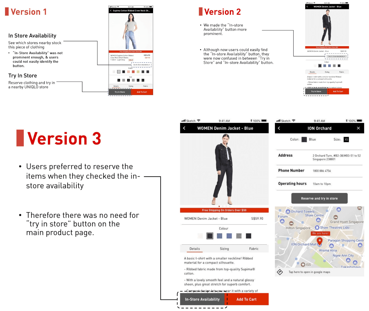
The redesign centred on two features: in-store stock availability, and reserving items to try on in-store. Testing changed the second one, users wanted to reserve and check stock, but the separate "Try in Store" button on the product page was redundant to how they actually shopped, so it was cut. Letting the tested behaviour override the original plan was the point.
The proposed solution
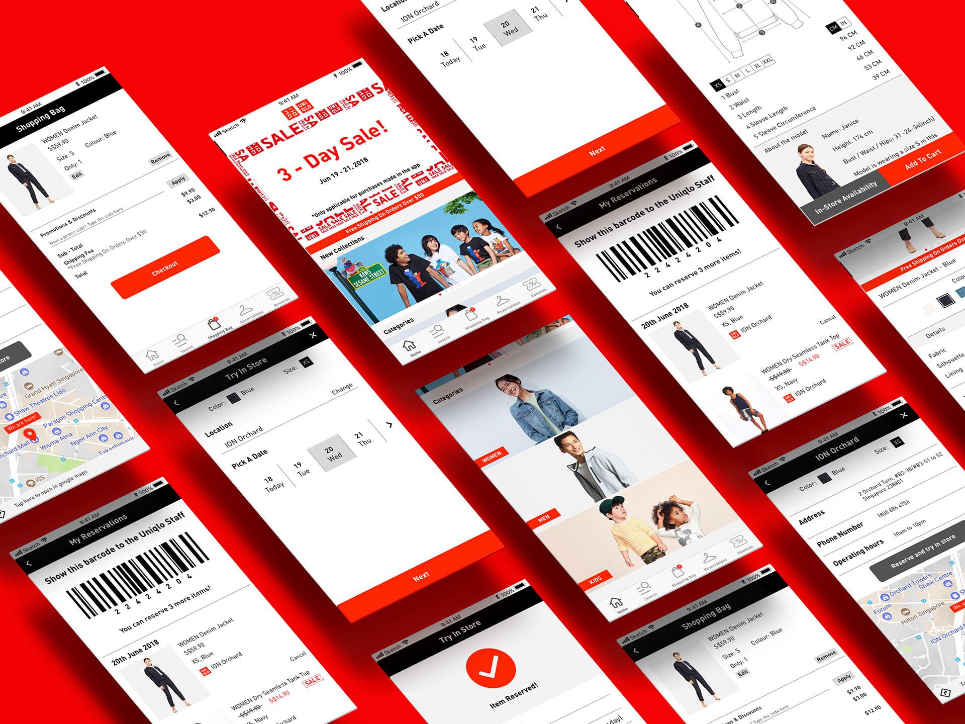
The redesign connected online and offline shopping in one app, built for simplicity and consistency: clearer navigation, a loyalty programme that turned the promo-code habit into points, in-store stock availability, and item reservation.