UOB — Personal Online Banking
A regional online-banking platform where I turned dense financial logic payments, transfers, multi-market rules into calm, high-trust flows.
Project Overview
Client: United Overseas Bank (UOB )
Industry: Fintech, Banking
My Role: Senior Product Designer
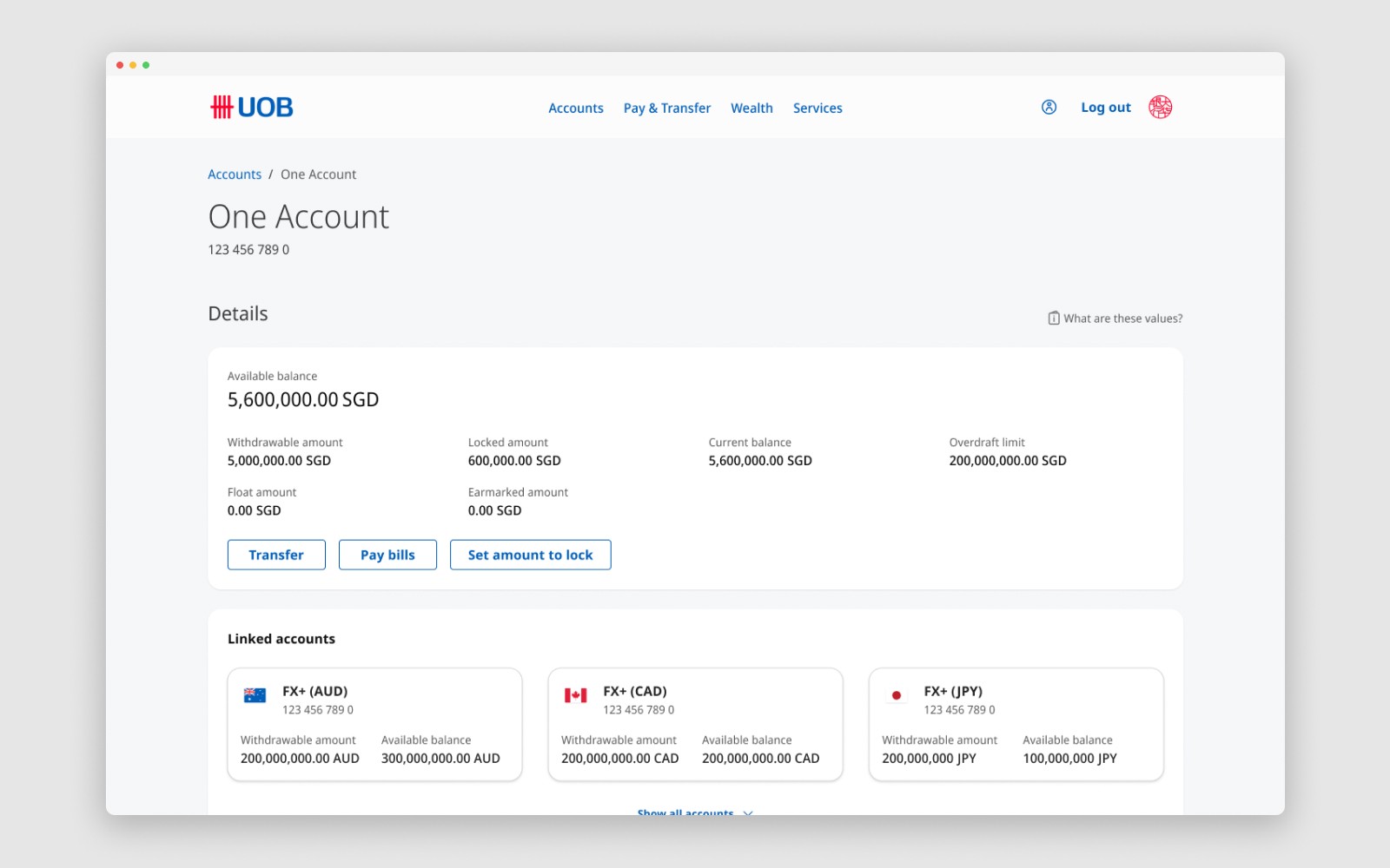
UOB was expanding its mobile-first personal banking into a full web platform across five ASEAN markets. The Pay and Transfer journeys sat at the centre of that work, alongside contributions to services and wealth, translating app features into scalable desktop experiences for a bank serving millions across the region.
For scale: after integrating Citigroup's regional consumer business, UOB banks 8.4 million customers across ASEAN, one in two acquired digitally. The web platform gives customers a full-featured alternative to the app, and in some cases their primary way to bank.
The challenge
A mobile-first app had to become a scalable web platform without losing functionality, while adding desktop-specific experiences.
The existing design system needed adapting for web, in close work with the DS team.
Singapore ran as the master build, then regionalised for five markets, each with its own regulatory rules.
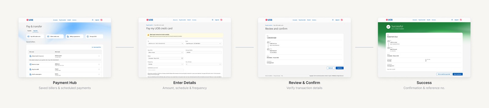
Pay and Transfer
Pay and Transfer was the hardest journey to regionalise. It carries the most variation across markets, and each country's rules reshaped the flow. Getting it right meant working directly with country teams and business analysts to translate market requirements into compliant, consistent designs.
With several projects shipping in parallel, the flows had to stay aligned with other banking products so the experience held together for customers. The working method was consistent throughout: propose the strongest design, then pressure-test it with engineering and other teams to land on something viable.

Competitor analysis
After the core flows shipped, I ran a structured benchmark against a major regional bank to pressure-test our direction and surface gaps worth addressing in later iterations. It scored both platforms across seven pillars, from information architecture to trust and error handling. I built the analysis with Claude and Figma Agent, turning screenshots into a consistent, scored comparison rather than a loose set of observations.
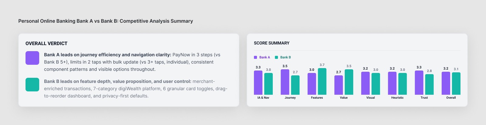
The benchmark was close overall, but the two platforms won on different things. Our platform led on journey efficiency and navigation clarity: a three-step transfer flow against their five-plus, bulk updates in two taps, and options kept visible rather than buried. The competitor led on feature depth and user control: richer transaction detail, a broader wealth offering, more granular card controls, and privacy-first defaults like masked balances.
The point wasn't to declare a winner. It was to produce a ranked list of specific, prioritised gaps to close: enriching transaction history with merchant names instead of raw bank codes, adding transaction search, a balance-masking toggle, and more granular card controls. A roadmap, not just a scorecard.
A workflow for 1,000+ breakpoints
Responsive breakpoints were the biggest bottleneck, well over a thousand across the platform. I pushed for handling them in code, which would have been cleaner, but dev and workflow constraints ruled it out. Rather than absorb the cost, I designed a Figma Agent workflow on top of the existing design system that generated breakpoints in a fraction of the time, and brought it into the team's process.
Live in production
The platform is live across all five markets, in daily use as a main way customers access their accounts.